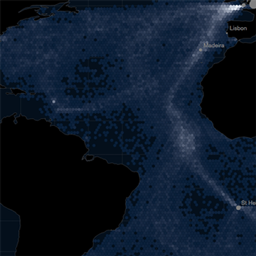
What a fun project this was. I collaborated with Scott Farley and Meghan Kelly to build this interactive map. The idea was to create an interactive that could visualize European maritime activity and climatological patterns from 1750 to 1850. We aptly named this Wooden Ships .
We primarily used D3 and jQuery to build the application. Data was collected from historic captains' logbook entries and ship locations were then aggregated by hexbin for generalization. Users can cue into specific captains' observations by clicking on a hexbin, and also filter ships by time, weather, and ship-nationality.
Check out the full version here.
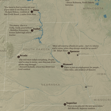
I've always had an interest in depopulation, so I thought mapping the lost and dying towns of the Great Plains would be a cool way to explore this topic. This map shows the extreme depopulation of the Great Plains by weaving together the stories of ten small towns in the region. Through telling the stories of these towns, I wanted to bring forth different themes of loss that have become endemic to life on the Great Plains.
All data was processed in ArcGIS. Individual DEMs from viewfinder panoramas were mosaiced to create a hillshade and national land cover data was obtained from the National Land Cover Database (NLCD) and then generalized. I used Photoshop to drape landcover over the hillshade layer. Vector data such as water bodies and administrative boundaries were overlaid and edited in Illustrator.
GIF available here.
A special thanks to Dr. Rebecca A. Buller of the University of Nebraska-Lincoln for her insight and assistance on this project.
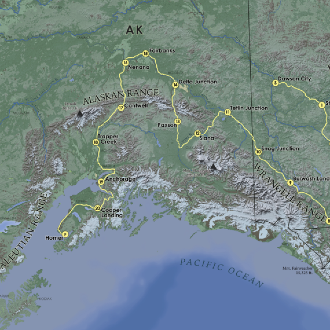
This was my first attempt at terrain representation. I created this map for an advanced cartography class at UW Madison. The challenge was to devise a 2,000 mile bike route over a backdrop of realistic terrain. This was one of the most fun projects I've worked on and it definitely sparked an interest in trying to hone the art of terrain mapping.
All data was processed in ArcGIS, and then Photoshop was used to drape landcover over a hillshade layer. Vectors were then overlaid using Illustrator. It goes without saying that making this map really made me want to explore the Yukon!
This was a fun one. I created this map for an advanced cartography course at UW Madison. The challenge was to style a basemap in a particular artistic style using MapBox and CartoCSS. Custom icons were also added.
The map attempts to mimic the form, color, type, and texture of the Matrix movie. Points of interest included on the map (see Sydney, Chicago, and Oakland) are all locations in which parts of the filming of the movie took place. For example, the AWA tower in Sydney is indicated on the map; this building was visible in a scene where Morpheus was dangling from a helicopter.
Check out the actual map here.
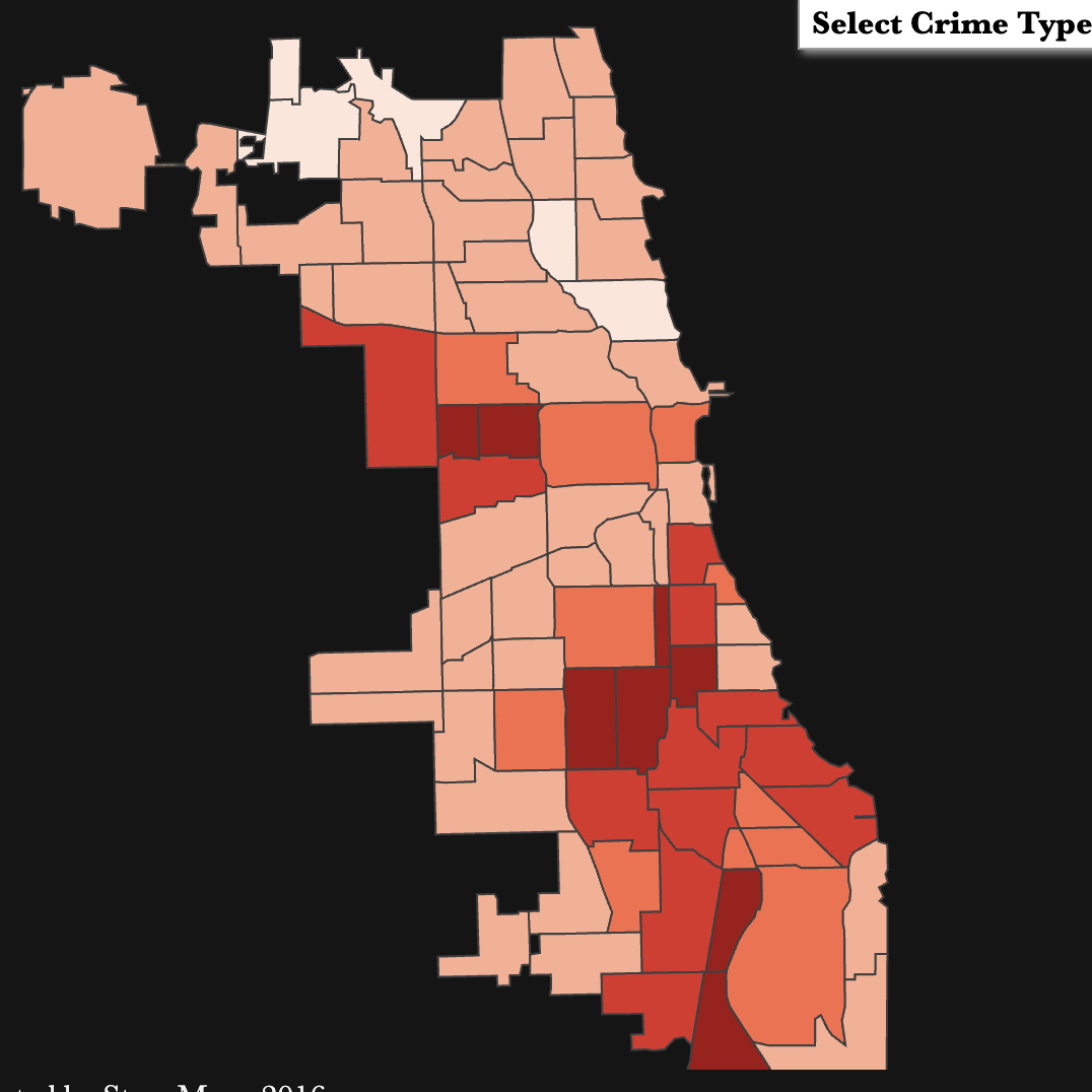
As with the other Chicago crime map, this interactive stems from my interest in the geography of urban crime. It also ties in with my Master's research, which involves examining the distribution of different crime types across Chicago community areas.
This was built in D3. The map allows users to query crime totals (assault, robbery, homicide, sexual assault, and burglary) for individual Chicago community areas. The corresponding graph shows the ranked crime totals by community area.
Interactive version available here.
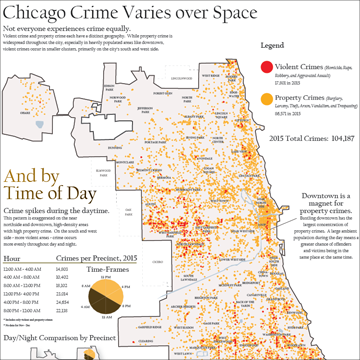
Having moved to Madison from Chicago in 2015, I was curious about the spatial and temporal patterns of crime in Chicago. Does violent crime and property crime share a similar geographic pattern? And during what time of day do these crimes occur?
Crime data is notoriously difficult to obtain, but luckily Chicago provides detailed geo-referenced crime data free-of-charge here, for anyone interested.
The resulting map is a dot density distribution of violent and property crime in Chicago. I also binned crime by time (4-hour intervals) in order to gain some perspective about what time of day crime tends to occur. Since I only looked at total crime for the temporal analysis, the next step would be to break down violent crime compared to property crime, by time of day.
You can find a full PDF of the map here.
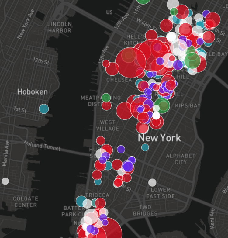
Where is talent located in the Bay Area? Where do tech companies decide to locate? This is a project I undertook as a GIS Analyst for the commercial real estate firm Jones, Lang, LaSalle. I took a deep dive in key Bay Area markets to explore the spatial distribution of talent and tech companies. Visit the web app here.
Key Features
· Visualize the talent pool in key Bay Area markets – where the educated workforce lives and where tech workers are most highly concentrated.
· Understand the spatial distribution of tech companies and where they locate in relation to public transit corridors.
· Retrieve demographic information at the block-group level to help uncover neighborhood-level insights.